FR
FR EN
EN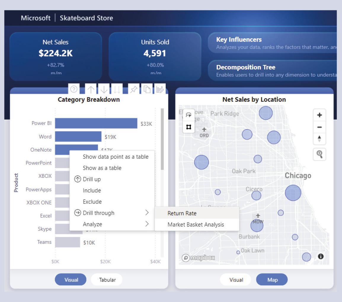
Decision-making is often based on a detailed analysis of data relating to the company's activity. The difficulty is to use a tool that is adapted to the growing amount of data and to the increasingly sophisticated demands for analysis.
Microsoft has therefore created Power BI Desktop: a free tool (downloadable from https://powerbi.microsoft.com), which allows the creation of highly interactive "Dashboards", capable of graphically presenting and analysing large quantities of data from sources as varied as simple files (Text/Csv, Excel, XML/JSON files, etc.), relational databases (SQL Server, Oracle, DB2, etc.), online sources (Office 365, Sharepoint, Microsoft Dynamics, OneDrive) and many others...
Once the data is obtained and cleaned via Power Query, it is integrated into the Power BI "Data Model" in order to create links between the different tables, and to add "Measures" (calculations) to produce the indicators displayed on our Dashboards.
Once the visuals are in place, the analyst can then interact with them to identify trends and key indicators for decision making. Once the report has been created, it can be uploaded to the Microsoft Power BI Cloud Platform (https://app.powerbi.com) to allow viewing and interaction with these reports via a simple web browser, on tablets and smartphones too!
We will see here some examples of Dashboards proposed by Microsoft, downloadable at the following address: https://docs.microsoft.com/en-us/power-bi/create-reports/sample-datasets
Good to know: The free version of Power BI allows you to upload your reports to your "private" space but for your own use only, the paid versions offer possibilities of sharing with others as well as much more advanced possibilities!
The Regional Sales Sample has the following appearance:

-
A simple visual showing a key indicator: the total amount of closed sales.
-
A graph showing future revenue from pending sales, by stage of the sales contract.
-
A graph showing closed and open sales, by product category.
If you wish to filter the report to include only the Accessories category, simply click on it in the Revenue Won and Revenue in Pipeline by Product LOB graph:

The visuals in this report are then all filtered to take into account only the Accessories category. A simple click on this same category will remove the filter and return to the initial state displaying all categories.
This functionality is called Cross-filtering and can be used on all visual elements of a report and, of course, it is possible to deactivate this functionality.
The Sales & Return Sample report allows you to analyse the sales of products, as well as those that have been returned by the buyer. In this example, a global filter (visible on the right) is applied to the report: only non-returned sales concluded in May 2019 are displayed here.

-
A simple visual showing a key indicator: the total amount of sales, with the text +82.7% m/m indicating that sales have increased by this rate between the chosen month (May) and the previous month (April).
-
The number of products sold, also with the text +80.0% m/m indicating the relative increase in the number of units sold between the selected month and the previous month.
-
A graph detailing the total amount of sales by product category.
-
A graph detailing the total amount of sales by outlet.
For sections (3) and (4), the buttons at the bottom of each visual allow you to dynamically modify the type of visual. For example, for section (4), if you click on the Map button, you will obtain a map in which each bubble will have a size proportional to the sales amount of each shop located on the map:

Similarly, if the mouse pointer is placed over one of the categories displayed in section (3) (Category Breakdown), a custom tooltip details the product in question:


It is also possible to configure a visual so that it displays another page of the report, while filtering the latter: this is called a Drill-Through. For example, if we right-click on the OneNote product, we can choose to perform a Drill-through to the Return Rate page which will show us the return rate of this product:
-
The OneNote product has a return rate of 55% for the month of May 2019.
-
A simulation can be made (What If...) of the impact on the amount of sales that a decrease in this return rate would have if it were to fall to 15%, for example.
-
The table shows, per store: in the Net Sales column, the current sales (taking into account the 55% return rate), in the Forecast column, the amount of sales if the return rate had only been 15% and in the Extra Profit column, the difference between Net Sales and Forecast.
-
This section is a graphical representation of section (3).

Finally, it is also possible to use Power BI's artificial intelligence to help us understand what most influences buyers' decisions, the "Key Influencers".
For example, here we have the Key Influencers, those elements that have the greatest impact on the choice of product purchased by men.

It was found that if the product is blue in colour, the buyer is 1.27 times more likely to be male than female. The fact that the product has a discount also plays an important role.
And here are the Key Influencers for women. Here we see that a green product is 3.49 times more likely to be bought by a woman than a man... The same applies to the product category XBOX.

There are many other possibilities and, of course, all of this being interactive we encourage you to download the free Power BI Desktop software and the examples mentioned to test for yourself the capabilities of this constantly evolving tool!
There are many other possibilities and, of course, all of this being interactive we encourage you to download the free Power BI Desktop software and the examples mentioned to test for yourself the capabilities of this constantly evolving tool!
Maybe
you'll like…